Monday, January 30, 2012

Randall David Tipton workshop

by Jo Reimer
Refuge
Watermedia on Yupo
20" x 13"
Refuge
matted

I participated in a workshop with Randall David Tipton over the weekend, making paintings on Yupo, a plastic "paper" from Japan. Randall shared his methods for using watercolor and acrylic paints and mediums on this interesting surface, but most importantly he talked to us about interacting with the landscape and remembering the emotion of the moment in order to make a painting without being photo-realistic. We mostly painted from memory.

In the past as I've moved through the landscape and been moved by the beauty of this earth, my thoughts have been rather useless for informing future work. I didn't think carefully about what I was seeing. I didn't ask questions of myself, like 'what is it about that patch of brush that I find beautiful?' or 'why does this particular sunset move me to tears?' 

I do take a lot of photographs and am careful about compositon which does help with memory, as does sketching. But being mindful about the emotions of the moment is necessary to making good paintings later.

Undersea
Watermedia on Yupo
20" x 13"
Undersea
matted
A mat makes a big difference in
the presentation of a finished piece.

Randall's website is here and his blog is here. His work is available at the White Bird Gallery in Cannon Beach and directly from him. His price list is on his blog.

My work is also available.


Friday, January 27, 2012

Piecings, continued

by Jo Reimer

These are more of the Piecings series of collage paintings I've been working on this week. I'm quite happy with a couple of them but not so much with others. I keep telling myself that this is just a start, that more and better work will come as I continue seeing what I can do with my palette of papers.

Orange, study
12 x 12" on panel

One thing that frustrates me has to do with how I work with my paper collection.

Most of my painted papers are in a big drawer in my work table. The drawer isn't full but it's cluttered and I've spent lots of frustrating time pawing through the paper, seeking just the right one. Sometimes it's color I'm hunting; sometimes it's visual texture or pattern. I'm not sure if I have too many papers or not enough variety.

Elizabeth Nelson sorts her painted papers in 9 see-through drawers, by color family. See her in action here.

Marge Malwitz sorts hers into flat cardboard boxes which she pulls from a cabinet.

I'm sure either system would work better for me than having everything in one big drawer.  I just need to make time to do the sorting and set up a system to keep it all under control. I put smaller bits in plastic boxes which I've dubbed "Compost" bins. That works well for smaller pieces or when I'm traveling... not so much for larger works such as I am aiming to do.

Purples, study
12 x 12 on panel

Split Complements, study
12 x 12 on panel
The following piece was done on a canvas board. The white paper and gold paper with grids is some I made myself. I laid linen thread between two sheets of tissue paper and then coated it carefully with gloss medium to seal the thread between the layers. This is NOT a favorite because I think the green paper strip is too wide but by the time I realized it the glue was well on its way to dry. It's a study and I learned from doing it.

Grid Study
12 x 16

How do you sort your collage papers?


Monday, January 23, 2012

Showing My Work

by Jo Reimer
photo by Marnie Fordice

Some artists wait forever and never have an opportunity to show their best work to the public.

Some artists show several times a year, all over the country.

Some have a once-in-a-lifetime opportunity... that's me.

Thirty original pieces from my Sermon Note series are hanging in the lobby of my church and will be up a total of 4 months by the time the work comes down on February 20. If you're in the area and want to see it shoot me an email at joreimer at comcast.net and I'll meet you there. It's on Cornell Road in Cedar Mill, Oregon.

In addition to the thirty original pieces ten 3' x 4' prints hang on the big walls. On the 9th of January there was a reception for me with 50 people in attendance. I spoke about how art and faith intersect for me and then the floor was opened to a lively discussion. It's difficult to explain how much this meant to me... to be a conduit for things that God wanted to visualize through me, and to be able to show the work to hundreds of people over such a great length of time. I'm humbled, and amazed, and grateful.


photo by Marnie Fordice

If you're interested in what I had to say I'll be glad to email the text of the presentation to you. Just ask. (email address above)


Wednesday, January 18, 2012

Embellishing Monotypes

by Jo Reimer

Last summer I took a 6 day Monotype in the studio of William Park, a Portland area painter/printer, co-taught by Bill and Royal Nebeker of Astoria. In that time I made a couple dozen prints. You won't see most of them. Occasionally I pull the stack out of my flat files to have a look but hadn't done anything with them until this morning. I got an email from Bill about a new monotype workshop he's offering and I decided I'd do something with the work I've already created. I enjoyed the class, learned to appreciate monotypes and monoprints, and am still a bit confused about the difference.  The discipline isn't for me. I'll stick to painting and collage.

So, I selected a couple of the duds and played around with them using oil pastels until I felt confident enough to work on the slightly better prints.

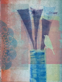
Put A Bird On It, print
The challenge given by Royal Nebeker in an evening session was to work with a stencil. (It's not really a stencil but that's what he called it.) It's a mask, used to prevent an area from transfering ink from the plate to the paper. You see several masks here. The lace shape on the left is a paper doily. The vase is a rectangle of paper, the long purple triangles are paper as is the bird.

I first painted the acrylic plate with inks and arranged the masks on top of the ink. Then the dry paper was placed over the plate and the sandwich was run through the press. Then I removed the masks, re-inked the plate with different colors and printed again.  At least that's what I remember. It was a blur of new techniques at the time and it's still a bit of a blur.

This is #1 raw print just as it came off the press. The problems I see are many...
     All similar values...
     Unrelated and uninteresting background colors
     Nothing pops... there's no focal point unless you count the ghostly bird


Here is the same print. I used oil pastels to increase color saturation here and there and to add more elements to the work, changing the ghost bird to a blue bird and adding more of the long triangles at the top. It's better, or maybe just different?

Besides William Park and Royal Nebeker my favorite local artist working with monoprinting is Kim Osgood.

Have you tried monotype? What do you like about the process? Do you use it as a first step or do you prefer the pure process?