Last summer I took a 6 day Monotype in the studio of William Park, a Portland area painter/printer, co-taught by Bill and Royal Nebeker of Astoria. In that time I made a couple dozen prints. You won't see most of them. Occasionally I pull the stack out of my flat files to have a look but hadn't done anything with them until this morning. I got an email from Bill about a new monotype workshop he's offering and I decided I'd do something with the work I've already created. I enjoyed the class, learned to appreciate monotypes and monoprints, and am still a bit confused about the difference. The discipline isn't for me. I'll stick to painting and collage.
So, I selected a couple of the duds and played around with them using oil pastels until I felt confident enough to work on the slightly better prints.
 |
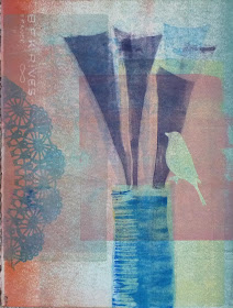
| Put A Bird On It, print |
I first painted the acrylic plate with inks and arranged the masks on top of the ink. Then the dry paper was placed over the plate and the sandwich was run through the press. Then I removed the masks, re-inked the plate with different colors and printed again. At least that's what I remember. It was a blur of new techniques at the time and it's still a bit of a blur.
This is #1 raw print just as it came off the press. The problems I see are many...
All similar values...
Unrelated and uninteresting background colors
Nothing pops... there's no focal point unless you count the ghostly bird
Here is the same print. I used oil pastels to increase color saturation here and there and to add more elements to the work, changing the ghost bird to a blue bird and adding more of the long triangles at the top. It's better, or maybe just different?
Besides William Park and Royal Nebeker my favorite local artist working with monoprinting is Kim Osgood.
Have you tried monotype? What do you like about the process? Do you use it as a first step or do you prefer the pure process?


Thanks for the report on your print making process Jo. I have been curious about prints for some time....
ReplyDeleteMy thought - I like the original best. I like the translucence of it and the layering.
ReplyDeleteSometimes we can't leave well-enough alone.
ReplyDeleteJo I prefer the second one. Congratulations on your exhibition! 4 Months gives ample time for your work to be noticed by many people. What a wonderful opportunity!
ReplyDelete