Showing posts with label acrylic. Show all posts

Wednesday, March 16, 2016

Fantasy Flowers


Jo Reimer: Fantasy Flowers  14x11" acrylic, watercolor, ink, paper
Sometimes a piece comes out of left field and insists upon being present within my body of work. This started one morning last year as I was dinking around with paint and a brush, just spreading color around and seeing where the wet paint would go. It got ugly fast so I put it away thinking I still had one side of the paper I could work on.  

Months later I spied it among the "works in process" drawer and decided to play on it with some ink. Hours and days later this is what emerged. I could keep working but I won't. It delights me just as is. The only bit of collage is the big yellow rose that satisfied the need for a place to rest my eyes.

Monday, June 15, 2015

Orange Blossom Special

 by Jo Reimer
Orange Blossom Special


We've had such beautiful weather that I can't stay out of the garden, so with my son's expert help we have the whole garden whipped into its best shape... ever. But there was a bare spot so I bought some of those short dahlias and as I was planting them I got the idea of making a bouquet that will last longer than summer. The vase colors reference my collection of green containers.

Orange Blossom Special, 6" x 24" x 1" 
collage and acrylic on cradled panel
$350.
Orange Blossom Special, detail

Tuesday, January 13, 2015

Painting Collage Papers. a tutorial

 
Ironing painted paper
My friend laughs at me for ironing my papers. But ironing them makes the paper flatten back out after they're painted and they're easier to store and use.

I spent an evening recently painting some papers in the color range that I need for a planned collage. It takes time to do paint my own papers to build my palette but it's necessary for my process and lots of fun. 

Painted Papers, ready to use in collage

Here's one of the methods I use to prepare some of my painted papers.

I start with plain white paper: blank copier paper and paper from laser printers (not ink jets), washi, printmaking papers, art tissue, tracing paper, pages torn from discarded books, and music  from old song books and hymnals, pages torn from old phone books and dictionaries. Just about any papers can be used except for cheap papers that fall apart in water (toilet paper, paper towels, regular tissue paper, tissues). I've saved some of the colorful paper towels that I use in the studio but rarely do I use them because of the rougher texture, though some people use these with great success.
 
 I use watery mixtures of acrylic pigments including fluid acrylics, acrylic inks, and airbrush acrylic (aka Golden's Hi-Flow).

And here's how it works for me:
 Mix the pigment with water, about 1:4. about 1-2 oz total should do the trick. Wear rubber gloves.
  • Work on a large tray of some sort. I use several old school lunchroom trays.
  • Place white paper on a sheet of plastic and get it fairly wet by spraying with water.
  • Using a pipette or straw or brush drop the color onto the paper, spraying and brushing to encourage the paint to flow over the paper. I like random rather than all over solid color.
  • Cover this paper with another sheet of plastic. Repeat the above steps. Repeat and repeat, building up the layers of paper and plastic.
  • Set aside for several hours or overnight to allow the colored pigments to flow over the paper, to settle in creases, to form patterns of color.
  • Before unwrapping the papers/plastic spread out large sheets of plastic over floors and furniture on which to set your painted papers for drying.
  • Wear rubber gloves.
  • Peel each sheet of paper off the plastic and set over on your drying surface. If there's pigment left on the plastic you can blot it up with another piece of absorbent white paper such as washi.
  • Once all the paper has been transferred to the drying surface it's a waiting game. The paper dries very quickly outdoors in warm weather but it takes overnight to dry indoors in winter.

 Ironing has been completed and paper is ready to use.


If you, dear reader, make some papers using this method, please send me a photo so I can brag on you.

Monday, December 09, 2013

Limited materials, limited palette

 
Songs of the Soldiers
Jo Reimer
Collage on Paper
7.5" x 7.5"
 On a recent week at the coast I determined to limit my art supplies and took only a small box of compost with an assortment of black and white and a limited palette of colored papers and supports. It was a good decision that forced me to seek variety within limits. I learned that it's possible to do satisfactory work with limited means and is an appealing challenge.

The name of the above small collage came from a piece of sheet music with my uncle's signature, dated 1918-19. Keith lost one arm as a teenager and couldn't serve in WWI but he loved to sing and I can imagine him thinking about those at war as he sang the songs that were currently popular... "Over Here" and "Over There" among them. The picture of the baseball player also was from that era.

Red Maple - Late Fall
Jo Reimer
Collage on Paper
12" x 12"
Red Maple - Late Fall is the main work I intended to do that week, an abstraction of the colors I saw from my front door, taken from this photograph:

Then I got out some paint (still the same color palette) and did a quick painting, remembering some recent weather:
Unsettled
Jo Reimer
Acrylic on Paper
9" x 12"
Then back to the collage box for the next piece:
Under the Clouds
Jo Reimer
Collage on Paper
9" x 12"
All these papers were ones I previously painted or dyed except for the brown, upper right corner.

And this is the final one in the series:
Teatro
Jo Reimer
Collage on paper
9" x 12"


Wednesday, October 23, 2013

Deep Blue... Mixed Media Collage


Deep Blue
Jo Reimer
9" x 12"
mixed media collage
This first completed collage of the week came about because I happened to put the photo of the ocean down on top of the painted paper. Composing the elements on a panel that I had just prepared with gesso over a failed effort led me to that sweet spot of knowing when it was just right.

Perhaps this makes the case for working with compost on a messy table.

Wednesday, July 10, 2013

Pueblo Pottery - Along Old Route 66. collage painting

Pueblo Pottery - Along Old Route 66
Jo Reimer
Collage Painting
22" x 17"
Acrylic, paper
As a young teenager I traveled from my home in Arkansas along route 66 through Texas and New Mexico to Arizona to visit relatives and was struck by the beauty of the pottery made by the Native Americans of that time. I particularly remember the matte black pots with glossy black designs, especially those made by Maria Martinez.

I traveled to Taos for an art workshop some years ago and was again impressed by the gorgeous pottery. I've tried my hand at molding clay but these hands are made for stitching and painting, not pottery.

Then a couple of years ago my husband and I took a long road trip from Oregon through Idaho, Utah, Arizona and New Mexico and once again I was drawn to the pottery. Though styles have changed here and there we saw similar work among the more contemporary, all beautiful in their workmanship.

This piece is my way of mapping the memories of my travels through the Southwest.

Thursday, February 28, 2013

Grass and Forest painting

Grass and Forest
acrylic on paper
15" x 11"
Today felt like a painting day but I needed to stay indoors so I pulled out a photo from a hike last year and went to work. I'm just getting a feel for the materials again so I didn't expect to produce a masterpiece but I'm satisfied with the work. I'll probably paint this again and again, and maybe soon I can return to the reserve and paint directly.

I used both fluid and heavy body acrylics, a mix of Golden and Holbein. with lots of water to make the work juicy. I'm leaning strongly toward using the thinner paint because I invaribly like to work thin so I get to play with drips and splatters.

Friday, February 22, 2013

Studio Table and Watercolor Paint Choices


Here it is the end of the week and I haven't posted about this weeks' work in the studio. There hasn't been a lot, and no painting, no collage.  I've been cleaning up the garden instead.  But I have been working in the studio, tossing a full cabinet drawer of files and reorganizing the remaining two drawers. It feels so good to have accomplished that.

With spring coming early to Oregon I decided to spend time on my sketching tools and the various bags I carry.  Here you see an area of my counter with some of the tools of my trade. Granted I'm at the end of the process so it looks tidy but you should have seen the mess.

The black bag on the right stays in the backseat floorboard of my car. The bag was intended to be a cosmetic bag for travel but it works better for sketching and paint tools.  The open palette is a W&N Cotman kit that was a freebie years ago and has seen lots of use. It's cleaned up for the season and mostly filled with my limited palette.

Some basic tools and a book I'm reading.
In this photo the black bag on the left is another cosmetic bag that I carry when I travel. It holds tiny bits of things I might need. I'll show you what's in that in another post if you're interested. Most things on this part of the counter are obvious and good ways to corral pens and pencils that are frequently used. The wire thingie is a vintage flower frog.  It really doesn't work well, prefering to hold flower stems, but I like how it looks so it stays there. The box cutter lives in a vintage glass tray that once held a dentist's picks.


Here's the car paint bag closed.
10" x 7" x 3"
nylon
I added D-rings on each side at the top and clipped a shoulder strap to the rings. There's also a metal shower curtain ring hanging on one of the handles so I can hang the case using an S-hook that lives inside. I've used this on an airplane quite successfully.

Opened partially, showing the handy compartments.
Opened all the way.
Check your local drugstore to see if you can find this Basics Cosmetics case. It's a dandy.

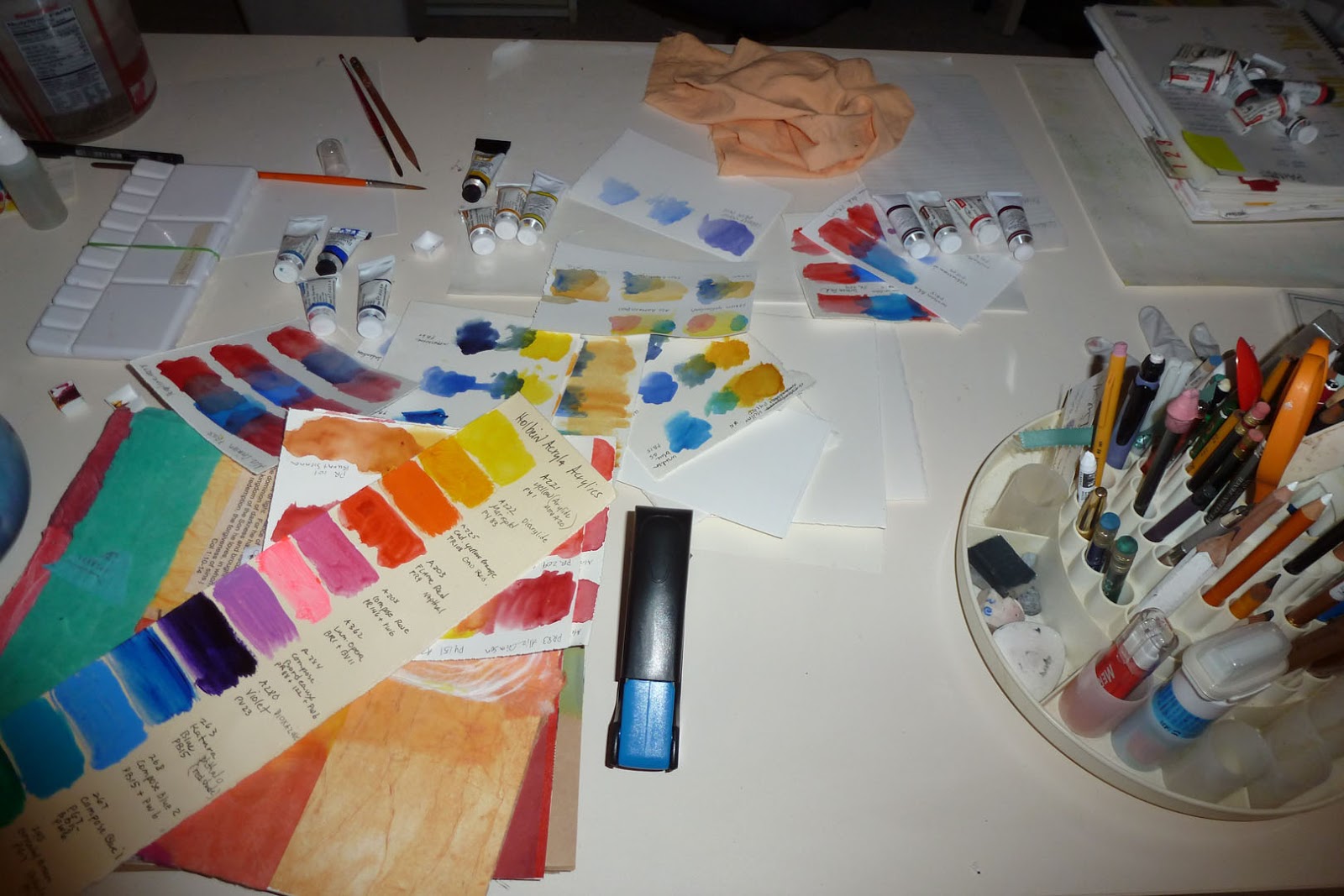
Watercolor, Collage, Journaling Table
This table is 30 x 60" and is a workhorse, used for all kinds of things, but this week it's where I've been testing watercolors in combination to see which I want to use in early spring.  The basic six that will help me capture the clear bright spring colors are Azo yellow, New gamboge, Winsor Blue GS, Ultramarine, Alizarin Crimson, and Winsor red.  Of course I'll modify and add to these basics, but for now that's what I'll play with.


For testing I gathered a stack of small pieces watercolor paper scraps and proceeded to test. I don't really know how to approach this so I just winged it. I first chose 3 blues and painted large spots of each down one side of the paper (see upper middle of picture) and then chose one yellow and painted beside and into each blue to see what sort of green the combination would give me. And that's how I approached each color in turn.

If you have a better way, please let me know.

I know I'll be painting with acrylics again and wanted to see how complete is my collection of Holbein Acryla acrylics. (The long narrow strip in the lower left of the picture is my record of colors I own.) Holbein uses such odd color names. For example, Flame red is really Napthol, PR9, but the only way to know that is to find the tiny paint number on the back of the tube.  So I hightailed it to Blick downtown and wrote the paint number on my Holbein chart so I'll know what to order in the future and bought a replacement since that's a frequently used one. 

Or maybe I'll revert to slinging paint based on what it looks like.  Probably will. Being organized takes the fun out of it for me.  So why go to this trouble? I need to know how to mix paint properly before I have the confidence to work with abandon. Otherwise I'm sure I'd just make ugly messes... like I've done too many times already.

That's my story and I'm sticking to it.  I hope you all have a great weekend.  Make something pretty.

Friday, January 11, 2013

Mapping New Work

 
by Jo Reimer

I've collected road maps since our initial trip west, many of them free from gas stations along the way. Some are tourist maps of cities, some AAA maps, some hand drawn. Maps have been a large part of my life, and maybe yours, too, though we now rely on Google Maps and the maps in our smartphones and our GPS. I still print out maps because I'm so used to the paper map.

So... one day I decided to shred an old map see how I could use the strips creatively. To me the strips of map are the roadway, the directions for how to get somewhere, the path I traveled, and because I make an effort to make art that reflects my own life history and emotions it seemed appropriate to investigate where my map collection would take me on canvas and paper.

Crossroads
22" x 17"
acrylic and collage on paper

   
Crossroads was the first in the series. Here I laid down strips of map to indicate a matrix of roads leading away from a city somewhere west, near the water.


From Franklin to Oneida
22" x 17"
acrylic and collage on paper
From Franklin to Oneida, 22 x 17, grew out of imagining the chaos of traveling through unfamiliar landscape, following a straight highway and suddenly coming upon a small town out in the middle of nowhere and wondering why people settled there in the first place.

Sea City
10" x 10"
acrylic and collage on paper

The design for Sea City came about from looking at an actual map of a coastal city and adding the main streets to the painting as strips of maps, though not cut from a map of this actual city.

 
Toward Mill City
5" x 20"
collage on board
Toward Mill City veers away from strips of map to using larger torn scraps of map to indicate the city and the straight shot of freeway driving between one town and another.

Wetlands
20" x 20"
acrylic and collage on board
As I was painting Wetlands I imagined looking down on the landscape from above, seeing a small town nestled between the rivers and creeks that flow through a rather wet landscape. Homes and businesses were built above the flood plain but were controlled by the flow of the water, while nearby the freeway soared above the landscape, bypassing the town altogether.

From San Antonio to OKC
6" x 24"
acrylic and collage on board
From San Antonio to OKC uses larger portions of the maps of two large cities as well as painted papers and slices of maps. 

As you can see, I continue to experiment with ways to use my maps. I've only scratched the surface as I search for more ways to use the idea of maps, travel, journey, and exploration.  I have lots more ideas and since this work is moving along so fast I'm confident that I'll have many more pieces to show you in the future.


Thursday, September 20, 2012

Summer Day, a painting

by Jo Reimer
Summer Day
acrylic, ink, paper, 12 x 12 panel
I've been having a grand time taking half-done paintings and seeing how I can resurrect them. Like this one.  I loved the hot colors but simply couldn't seem to figure out how to make anything of it.  Finally I simply started playing, adding and subtracting elements. This is the result. It looks great in a simple black frame.

Thursday, June 07, 2012

Floating Island

by Jo Reimer
Eastward, from the Rising Sun
Collage on board
12" x 9"
Last week while walking along our pristine northern Oregon beach we came upon a large piece of styrofoam, about 3' x 2' x 2', mangled and battered like much of the flotsam carried to the westernmost shore on the lower 48. But this wasn't an ordinary piece of  junk; we're pretty sure it's the first of the debris from last year's tsunami in Japan. 


Just a couple of days before our beach discovery we watched a news story from Alaska where quite a bit of debris is appearing along their shores, much like this one, and the yellow and white styrofoam was identified as building insulation.  It makes me so sad... to think about what's coming and why.

I wrote the above last night and now this morning there's a newspaper report and photo of an entire floating dock from the Japanese city of Misawa that washed ashore on Agate Beach, in central Oregon...66' x 19' x 7'! The cleanup of beaches along the northern Pacific will be a horrendous task over the next years. There's an enormous island of debris heading our way as well as countless other pieces.

Sometimes we think that what happens in another country isn't important to us, but it so often affects the whole world.  I remember when Mt. St. Helens blew her top in 1980, coating our farm with several inches of ash, turning our part of the world a sad, dead gray.... and then came the incredibly beautiful sunsets all around the world for the next two years because of the ash in the atmosphere.

I had trouble with the title of the above collage until I remembered that Japan is sometimes called the Land of the Rising Sun. The piece is quite sunny except for the "debris island" which floats down the center.

Wednesday, May 16, 2012

Garden in Bloom

by Jo Reimer

Garden in Bloom
30" x 22"
Collage Painting on Paper
Set a sheet of white paper on the table with the tools of your trade arranged within easy reach and paint all day. Cover the results with a coat of gesso and start over. Repeat 3 more times. Decide that this one won't be a masterpiece but it WILL be a fine birthday present for an appreciative granddaughter.

I struggled with this sheet of 300# watercolor paper for several days and nothing I did seemed to work. Finally I decided that some of the lines looked a bit like stems and some of the circles looked like flowers. A friend advised turning back to collage, so this is what resulted. It might be done. I might draw on top of it. I might move on.

detail


Sunday, April 15, 2012

Random.. a painting

by Jo Reimer
Random
acrylic on paper
22x30"

This is what happened recently when I set out to paint with absolutely no intention other than to use complementary colors, in this case orange and blue. I chose lines and circles with grid lines and just kept painting until the composition came together. At first I called it ugly but after looking at it for a few days I find I quite like it. But for sure I prefer to paint with some realistic thing in mind... landscape, flowers, still life... although with my surface design and quilting background the geometry of pure design continues to pop out of me now and then.

Friday, February 03, 2012

Golden Morning Light

by Jo Reimer
Golden Morning Light
10 x 13
watermedia
As I opened my eyes this morning and looked out the window the trees to the west were bathed in an intense golden light which turned non-descript gray barked trees into something magical. I tried to capture the essense of the moment. It's there but mostly in my memory. My painting skills aren't there... yet.

Monday, January 30, 2012

Randall David Tipton workshop

by Jo Reimer
Refuge
Watermedia on Yupo
20" x 13"
Refuge
matted

I participated in a workshop with Randall David Tipton over the weekend, making paintings on Yupo, a plastic "paper" from Japan. Randall shared his methods for using watercolor and acrylic paints and mediums on this interesting surface, but most importantly he talked to us about interacting with the landscape and remembering the emotion of the moment in order to make a painting without being photo-realistic. We mostly painted from memory.

In the past as I've moved through the landscape and been moved by the beauty of this earth, my thoughts have been rather useless for informing future work. I didn't think carefully about what I was seeing. I didn't ask questions of myself, like 'what is it about that patch of brush that I find beautiful?' or 'why does this particular sunset move me to tears?' 

I do take a lot of photographs and am careful about compositon which does help with memory, as does sketching. But being mindful about the emotions of the moment is necessary to making good paintings later.

Undersea
Watermedia on Yupo
20" x 13"
Undersea
matted
A mat makes a big difference in
the presentation of a finished piece.

Randall's website is here and his blog is here. His work is available at the White Bird Gallery in Cannon Beach and directly from him. His price list is on his blog.

My work is also available.


Wednesday, November 02, 2011

Sango Kaku... an acrylic painting

Sango Kaku  

This acrylic painting was done on a cradled 12x12" canvas.
Our back yard is filled with beautiful trees, many of which are Japanese Maples that we grow at our nursery. The Sango Kaku, aka Coral Bark Maple, is amazing any time of the year with green gold leaves in spring and summer, turning yellow and then coral in autumn. Then after the leaves drop the twigs and branches turn bright coral red to brighten our winter landscape. 

I stare at the tree from my studio and kitchen windows and have taken several photos over the years. Finally I decided to paint it. Why render an exact copy in paint? That's not my kind of art. So I set out to paint my feelings about the tree. When I finished I thought I had failed, but today I realize that I managed to capture the essence of the tree. A burst of yellow orange. Accents of bright rusty orangey red at the edges. The afternoon light striking the leaves, making them glow. Coral bark. Blue sky reflected in the pond. 

I'm not so sure about the underlying grid... but that's part of my history and way of working. So there!

Wednesday, May 11, 2011

Calla Lily - finished

Calla Lily
22 x 30"
acrylic on paper
Here's the completed painting. I like it more every time I come back to have a look.  If you click on the image you'll be able to see some of the detail. I'll put it away and put up another sheet of paper and see what happens.

Saturday, May 07, 2011

Portrait of a Calla Lily


Painting again
I've been painting again and it sure feels good. It's been way too long since I felt the need to pick up my brush and move the paint around. What set me off was a bouquet of white calla lilies with their long stems and graceful shape. I very nearly waited too long to start... the blooms had started to turn brown on the tips before I set up at the easel. But since I don't want to worry about realism in my approach to the canvas I didn't let a few dead bits stop me.

The painting isn't finished but here's an early view to show you that I'm actually working.

And you can also see a bit of the area where I've set up my easel. It's a tight fit between a bookcase-turned-paint-storage unit and my flat files-turned-taboret. This isn't a perfect setup, mostly because the light is bad, but I'll play around here for awhile and see if it grows on me. I do like having the easel against the wall instead of in the middle of valuable floor space, and it's positioned so I can easily get a long view from across the room or even out in the hall.

Catalog as Journal
The Anthropologie catalog arrived in my mailbox a couple of days ago. Now mind you, the clothes in that store don't suit my style but whoever designs the catalog appeals to my sensibilities in a big way. The pages are spare with lots of negative space that just cries out for journaling and the beautiful scenes are perfect backdrops for more collage. Maybe Little Jo will go visit India along with Anthropologie.

My plan is to take the catalog apart by removing the staples.  Then I'll sew strips of fabric to the spine of each double page to stablize it, and add more bits of fabric and lace and collage bits here and there with machining. When I've redesigned the pages to suit myself I'll sew the pages back together and into a more sturdy cover, and I'll end up with a new daily journal for the rest of the spring.

My blog buddy Susie LaFond had a similar idea and posted about it on her blog today. Click here to read what she has to say.  I loved her encouraging words, "Go out and find a puddle to play in". Amen!

Wednesday, April 27, 2011

Painting Collage Papers... again


Painted tissue
 You should see the mess in my studio! Yesterday the whole room and all the surfaces were tidy enough for company, but now a mere 24 hours later it's a royal mess. 

Painting Papers

You see, I enjoy using papers I've painted for my collages and although I hadn't run out of collage papers what I do have seems a bit tired to me and I wanted some fresh colors to work with... encouraged by once again watching Carrie Burns Brown DVD on preparing papers, Water Media Collage Workshop.  So last night I cleared off the big work table and covered it with 2 layers of plastic and a layer of tissue papers. I got out my box of Golden Fluid Acrylics, some water and some brushes and got to work.

First thing this morning I ran to the studio to see the dried papers. WOW, they're beautiful. So of course I spent most of today painting more pretty papers and now I'm waiting for them to dry. If I lived down south I could work outside and the acrylic would be dry almost immediately But this is Oregon, so I wait. It'll be worth it.  Then I'm paint some more until I'm satisfied that I have enough for awhile.

Wet papers drying on the work table
Acrylic paint has a limited shelf life.

Fluid acrylics, as well as tube colors, have a limited life. The fluids start solidifying after a couple of years, even capped and stored upside down. After awhile the product more closely resembles the consistency of acrylics that come in tubes, and after a few more years they go solid on you. Same with tube colors. They solidify in the tubes.  I had to toss a few and am determined to make use of what's still good.

Moral of this little story:  Buy only what you need. Use what you have.

Wednesday, June 23, 2010

Making Journals from Scratch, continued

Studio Journals

“When you bind an art journal do you paint your pages before you bind the book or after it’s bound?”


Pages can be prepared either way. If you like the experience of opening a fresh journal with pristine white pages then go ahead and bind the paper into a book format using whatever binding structure you want… or skip the binding step and buy a blank book. My first art journals were blank coil bound books  but once I learned that I could choose my own paper and bind it myself that’s what I’ve done, (pictured above). I especially like gutting an old book that’s no longer useful and adding my own signatures using a good paper. There are lots of books, YouTube videos, and online tutorials/ classes that will walk you through the process.

My first self-bound art books were made following Teesha’s instructions here.

Other times, especially when I’m making a theme journal I’ll paint a few pages of a good paper and then tear it down and bind it as a coverless book. One such book is Teesha Moore’s 16 page journal.
 
I have a large stash of paper that has watercolor or acrylic paint on one side that I worked on in a class or as experiments that didn't come to completion, work that isn't frame-able the way it is. This paper is perfectly good and I keep it because I can't bear to throw away expensive paper, knowing that I can re-purpose it. That's what I often use for my journals and that’s what I used for my Nature Journal. Sometimes I do nothing further to the paper before tearing it down and other times I paint the other side in similar colors so there'll be continuity of color throughout the book.

For the Nature Journal I wanted to push back the color that was already on both sides of the paper so I tore it down to page-spread size and smooshed white gesso over the paint using a broad palette knife and a credit card as a squeegee. Gesso gives strength to the pages, keeps them flexible, and provides a good painting surface for acrylic paint or as a base for collage when using acrylic medium for the adhesive as I most often do.
Related Posts Plugin for WordPress, Blogger...