

Jo Reimer, an artist, living and working in Portland Oregon
Monday, June 30, 2025
Featured Artist at Catherine Bede Gallery
Preparations are winding down as I complete the inventory and pack my car. I've been invited to be the featured artist at a local gallery during the Hillsboro First Tuesday Art Walk and I'm excited to present my work to my new community. I'm taking lots of smalls, paintings and collages in an affordable price range, along with a few larger works.
As well as the Art Walk, the weekly Farmers Market will fill part of Main Street, which will be closed to traffic, making it easy for pedestrians to wander among galleries, restaurants, food carts, and farmers produce. Live music in several shops add to the excitement, as does the roar of vintage cars showcased in front of the courthouse.
I can hardle contain myself.
I've been obsessed with painting flowers. I began in the winter, learning to see and paint lovely posies from Trader Joes, and now am painting flowers that grow in my own front yard. Here's an example of a 6 x 6" flower painting on a wood panel.
Save the date, October 18-19 for Washington County Open Studios. I'm participating this year and sharing my space with pastelist Harley Talkington. More about that later.
I'd love to hear from you. Comment below or email me at joreimer-at-comcast.net. (leave out the dashes, of course)

Tuesday, February 22, 2022
Never Give Up. Never. Never.
Have you ever stopped doing a creative practice and then tried to restart after a solid block of time has passed? It's not a pretty picture!
Do as I say, not as I have done. I stopped painting. I stopped making even the smallest collages. I stopped sketching. I stopped practicing my art.
And now I'm struggling to get back to where I left off. Really struggling.
I stopped sewing.
When we downsized five years ago I thought I'd give up sewing... and I did for quite some time, maybe two years. Then one day I had the urge to make a knit top but even with the experience of making clothes since I was 9 I had forgotten some basic skills.
I had forgotten a basic alteration I always make to a pattern so it was cut wrong at the start.
I forgot which way the thread should unroll off the bobbin and did it backward. Had to rip out the very first seam I stitched... after I remembered how to change the stitch length! I had sold my serger so had to figure out how to finish the seams without it.
The top didn't fit. Of course it didn't. I had given up the practice.
I stopped practicing art-making.
I had excuses. There was a letdown after my successful Open Studio and I was tired. Then came the holidays and a wonky schedule. I had some health issues that slowed me down and I drifted away from my normal studio routine. I gave up painting, drawing, collage.
Now I'm struggling to get back and I'm making all sorts of beginners mistakes that are quite frustrating. But I'm trusting that I'll slip back into those neural pathways I laid down in my brain and find my mojo soon.
Then I began again.
HOW? How did I begin again?
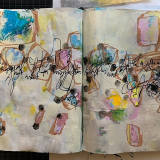
- I joined Cheryl Taves's #insightcreative30daychallenge at the first of the year and while I haven't kept up with doing a journal page every single day according to her prompts, I have resumed my regular practice both in my new studio journal and writing Morning Pages.
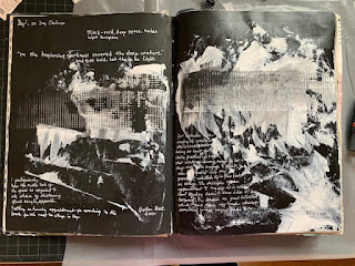
Journal spread using black Journal page using white over color
- I spend a few hours each week mixing paint. That's such great fun and results in some awesome collage paper.
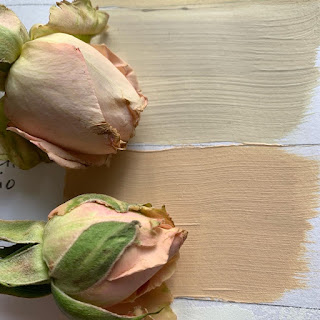 |
| Matching paint to roses |
- I've decided to spend up to $15/week on flowers for the studio... and I'll draw them, use them to inspire paintings and collage papers. The bunch of roses I bought yesterday are gorgeous, sort of a buff titanium/dusty pink color and so lovely. I've matched the colors and painted the roses... not worth showing, either but I won't let that throw me
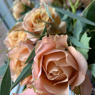 |
| This week's flower selection |
- I began a series of works on paper using paint and glue. The results are rubbish so far but I'll continue adding layers, knowing that as I work the ideas will come.
- I began drawing... blind contour drawing.
 |
| Blind contour drawing of the roses. |
- And I signed up for CVP 2022.
Blind Contour Drawing
For those of you who aren't familiar with this method, it's a simple and deeply satisfying way to look and draw. While looking at your subject, and without looking down at the paper, draw the object, following the contours/edges as though you are an ant crawling across the edges, letting your hand move along with your eyes, slowly, steadily, without peeking. The results will surprise you. Make it a game. Do it over and over. One drawing after another until you run out of time or your hand cramps. Yes, you can look between drawings. Click here for a video about Blind Contour Drawing.
Draw with ink. Use a cheapo ballpoint or whatever you have. Maybe you prefer a pencil.
You could use an old textbook or book of poetry as use as your Blind Contour Drawing journal and draw right on top of the pages. Or lightly coat each page with gesso first. (Let it dry before drawing or try drawing into the wet gesso.)
NEVER, NEVER, NEVER GIVE UP.
Even if it's only a simple drawing or collage or watercolor painting, keep up the practice of showing up and doing a bit of creative work.
Are you considering Nick Wilton's Creative Visionary Program? I've signed up for the third year. It's the most helpful course I've ever taken and while it's pricey it's a huge bargain compared to what you get in art school or from taking a few of the usual weeklong workshops, either local or distant. With CVP you'll have three months of intensive direct online involvement and then 9 more months of interaction with the teachers and other students and alumni, plus you get a deep discount when you enroll again in future programs. Call or email me if you want more information.
(Using this affiliate link gives me credit and costs you nothing.)
Sunday, February 13, 2022
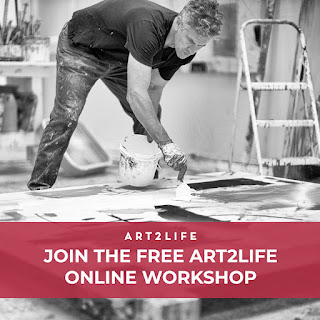
A VALENTINE GIFT FOR YOU!The free Art2Life workshops start tomorrow, February 14. Don’t miss out. A week of intensive and fun experiences, delivered online, will help improve your art quickly and easily no matter what medium you prefer. Workshops and daily Facebook Live events will be delivered throughout the week to those who register. I’ve done the free workshop for three years running and my art started to get way better right away. I work with acrylic paint and paper collage as well as using watercolor for urban sketching. The training helped me with all these media and you can expect the same for yourself if you do the work. Click here or on the image to register: |
 |
The workshop week is really free… with no hidden costs, no annoying catches…. just 5 days of short classes and events delivered by my fantastic teacher Nicholas Wilton and his Art2Life team. Their unusual take on using Design, Value, and Color to make better art will be a game-changer for your art. The week of events begins tomorrow, February 14. The workshops are recorded and delivered online at your convenience so that you can view them at any time until February 23. Grab your sketchbook and a pen and join me for the Art2Life free workshop. |
Thursday, January 27, 2022
For any struggling beginner or experienced artist....
Do you need a transformation…maybe a new way to look at your work? Do you find yourself getting stuck in old habits? Are you a beginning painter who wants to know more about how to master composition?
The workshop includes 3 video lessons that cover the principles
of Value, Design and Color, and are released over the course of 5 days. Each
lesson is about 20 to 30 minutes long. You can watch the lessons any time after
they’re released through February 23rd. In addition to the video lessons
you receive via email, there are also Live, in-Studio Trainings all week. These
Live, in-Studio Trainings will give you the opportunity to ask questions and
see the A2L Principles applied to artwork in real-time. You’re going to LOVE
this! I’ve seen first-hand the changes this makes for artists, so I know how
helpful it can be.
Click here to
save your place in the free Art2Life Workshop!
At the end of the Free Workshop, there is an opportunity to
enroll in the 3-month Creative Visionary Program. This program is suitable only
for those wishing to go much deeper with the content of the Free Workshop. It
may or may not be right for you but regardless, the Free Workshop is super
helpful…and FREE!
Monday, October 25, 2021
October Wrap-up to Open Studios
|
Thanks
for visiting my studio! |
||||
|
I’m so grateful for the good
turnout last weekend as I opened my home to art lovers who were touring
Washington County studios. The weather was great and interest was high. Thank
you for coming out and supporting me. Most of you know that I have
two spaces in my home set up as art studios: the original one at the back in
what might otherwise be a master bedroom, and the messier area in half of the
garage. People had a look at much of the art I’ve created in the past 5-6 years and I’m happy that many pieces went to their forever home. Visitors expressed many times how they were inspired and motivated to be creative after seeing how I fit art into my everyday life. Great! That’s exactly my intention… to inspire others to be creative. Collaborative Painting Ahead of time, I set out six 12-inch quarter-inch thick birch
panels on the painting table. Every guest was invited to take a non-brush
tool and leave their acrylic mark on the boards.... creating the foundation
for a collaborative work of art.  Early
Monday I restored the garage to its normal function and reclaimed the parking
spot, itching to tackle the 6 panels. I pulled out an old book and glued the
pages to the panels using acrylic gloss medium as glue and on top to seal and
let the whole shebang dry overnight.  The next day I pulled out my palm sander and went to work.. sanding down the panels, removing much of the paper while leaving the transfered text and some of the paper, and this was the result. It’s hard to see detail, especially if you’re reading on your phone, but believe me that some of the details on each of these boards are achingly beautiful, especially with a coat of gloss medium to pull out the colors. And then….
|

Tuesday, October 12, 2021
OPEN STUDIO OCTOBER 16-17
You're invited!

Washington County Open Studio Tour - October 16 and 17, 2021.
Hours are 10am-5pm.
Link to the map.
If you can't visit in person, most of the work is on my website.
Link to Jo's website
The tour is free. Pick up a physical map at the studio or any participating artist as well as The Village Gallery.
Both areas of my studio will be open, following current Oregon masking and distancing protocols. Please wear a mask. And no, I don’t like them either.
I have some fun things to share with you including a collaborative painting project whereby you get to add your own marks to a group painting.
Take your time; look around; get ideas for your own studio setup. Mine's in the garage and in a reclaimed bedroom. Lots of paintings are on display, most for sale, some at discounted prices. Greeting cards are available, too.
Here are a few works on display and for sale.


Wednesday, September 22, 2021
SHOT FROM A TALL LADDER - THE GARAGE ART STUDIO
Welcome to another online studio tour. I hope to inspire you to make-do with what you already have.
This is my garage studio
One of the bays in our garage has been repurposed; it’s now my painting studio in all but the most inclement weather. A workbench and some shelving were already in place, and I added a couple of tables, two trolleys, my easel, a tool chest for paint storage, and a child’s toy cabinet. A friend built a freestanding painting wall from three hollow core doors so I can use one side for paintings in process and the other for display. Since I took these photos I claimed the opposite wall for large canvases, and during Washington County Open Studios I’ll spread out across the entire garage in order to display more artwork.
 |
| BEFORE |
It was pretty but dark, so I increased the lighting and covered everything with white paint.
 |
| AFTER |
 |
| THE PAINTING WALL AND 4FT. TABLE |

6FT PAINTING TABLE
 |
| TOOLS OF THE TRADE |
The drawers of the workbench hold miscellaneous items such as sponges, paint rollers, assorted paint sticks, inks, paper, and even a few woodworking tools.
I use tools and supplies intended for other uses. The yellow tray is a styrofoam meat tray. The red plastic box came from a paint store, intended for paint and roller. The black covered take-out container has been repurposed into a small stay-wet palette. I used the big lazy-susan container at the rear on my desk for years... bought for office supplies and now for brushes. And of course, there are the yogurt cups and brushes for water... must have lots of water handy.
 |
| PAINT TROLLEY |
 |
| TOOLS OF THE TRADE |

I'm forever grateful to the former owners of this house for building out this corner of the garage so I didn't need to do so. Plastic on the workbench, paintings, foam-core, old magazines, canvases, and my heater, all up and out of the way on those shelves.
I hope this peek at my garage studio inspires you to make do with what you have, and that those who live close enough will come to see the studio in person on the weekend of October 16-17 during Washington County Open Studios.
I'll have free maps available to direct you to the many other artist's open studios within the county.
I'm asking all visitors to wear masks. This is my home and I must protect my family.
There are two studios.
Yes, you read that right. You'll enter the garage studio, and after looking around there, you can go down the path to a back door into the collage studio where I'll limit visitors to 4 at a time. Read about this studio in my last post.
If you find a work of art that is just right for your home you can pay with a card, cash, or through an app. We make it easy to claim your treasure.
I'll have all sizes and price points available, from $4 cards to larger paintings... there's something for everyone.
Come any time between 11 and 5 on October 15 or 16. I'll be waiting.
Jo
Tuesday, September 07, 2021
Don't put it down; put it away
Don’t put it down; put it away
… that’s Mom-speak which still rings in my ears.
My goal is to have this place show-worthy when you walk in
the door, but when I go to put an item away, I find myself wanting to play with
it instead… to paint, or draw, or glue, or sit down to write a newsletter. The
writing comes lots easier than using the Mailchimp software. And now I’m paying the
price: two untidy studio spaces.
Two studios in one small house!
Yep, I’m gradually taking over the house. And how grateful I am to have room to play right here at home. I began the takeover when we moved in 5 years ago, downsizing everything. I disposed for two-thirds of my art supplies, but that still left lots, and I can’t resist buying more and scattering it all about, too.
We decided to sleep in the smaller of the bedrooms and let me remodel the master for art-making. That worked for about a year, and when we gave up the extra car my greedy eyes fell on the empty bay of our two-car garage… the wider side and the workbench. So, I went to work converting it into a painting studio while preserving the original studio for collage, office, reading, and sewing.

Visualize me on a tall ladder with my handy smartphone
camera, taking overhead shots so you can see the mess! That was such fun that I made
detail shots about what’s used where and why, hoping that my
setup strikes a chord with you. Watch for future newsletters and come see it
all in person.

The middle of the room is taken up by two tall 2 x 4 ft. tables that give me standing room to work with paint and paper. It stays messy but that's a sign of the artist working daily at her job.


Painted plywood is used for the top of the flat files and I placed a tall Ikea table over that, leaving a
5" high space between for unresolved paintings.

Save the date! Mark your calendar now!
October 16-17 from 11:00 until 5:00.
14150 NW Bordeaux Lane, Portland, OR 97229
Masks required.
Email me your address if you want a postcard reminder:
joreimer255 @ gmail.com (no spaces)
Saturday, February 20, 2021
WETLANDS sketches
Last week I showed you how I taped off a large sheet of paper, preparing to paint some sketches of the nearby wetlands. I made the six sketches using acrylic paint, collage papers (paper bag, washi paper with embossed leafy vines, heavily textured washi, and drawn lines.
Like sometimes happens, some of the results were very helpful in moving forward and some told me what not to do.
I scratched back into wet paint to make grass-like marks and used parallel lines to indicate the boardwalk. That led me to thinking about symbolism and how to use symbolism within abstract paintings to reference my thoughts and emotions and observations.

Scratchy lines in wet paint indicate the tangle and chaos of the vegetation.
Tall curvy and dark lines refer to the trees along the edges of the wet.
This week I'll work with those ideas to paint on 4 12" panels, a 16x20" canvas, and a half-sheet of mixed media paper. It's simply experimentation and having fun with no preconceived outcome.
I have no idea what the results of all this might be. and that's okay.


Friday, February 05, 2021
Still Scattered
I goofed on the links on the last post. Click the image to sign up for the free workshop.

Subscribe to:
Posts (Atom)
