Showing posts with label 12 x 12. Show all posts

Monday, February 11, 2019

When Push Comes to Shove....


...... I can do whatever it takes…. 

….and does it ever feel good to finish the hard thing, which this time was making the artwork for a show at The Village Gallery in March. 

I did the serious planning and a bit of work in December and as soon as the holidays were behind me I geared up, and yesterday I was able to take the finished work to be photographed. Whew!  Twelve rather complex collages in 6 weeks is a personal record.

I’m proud of the work I’ve done and am excited to see it all hanging.  I hope you who live in the area will come see the show between March 3 and 30, 2019. Maybe you’ll find something that’s just right for a wall in your own home.
 
"ORANGE WITH BLUE AND GREEN"   $375
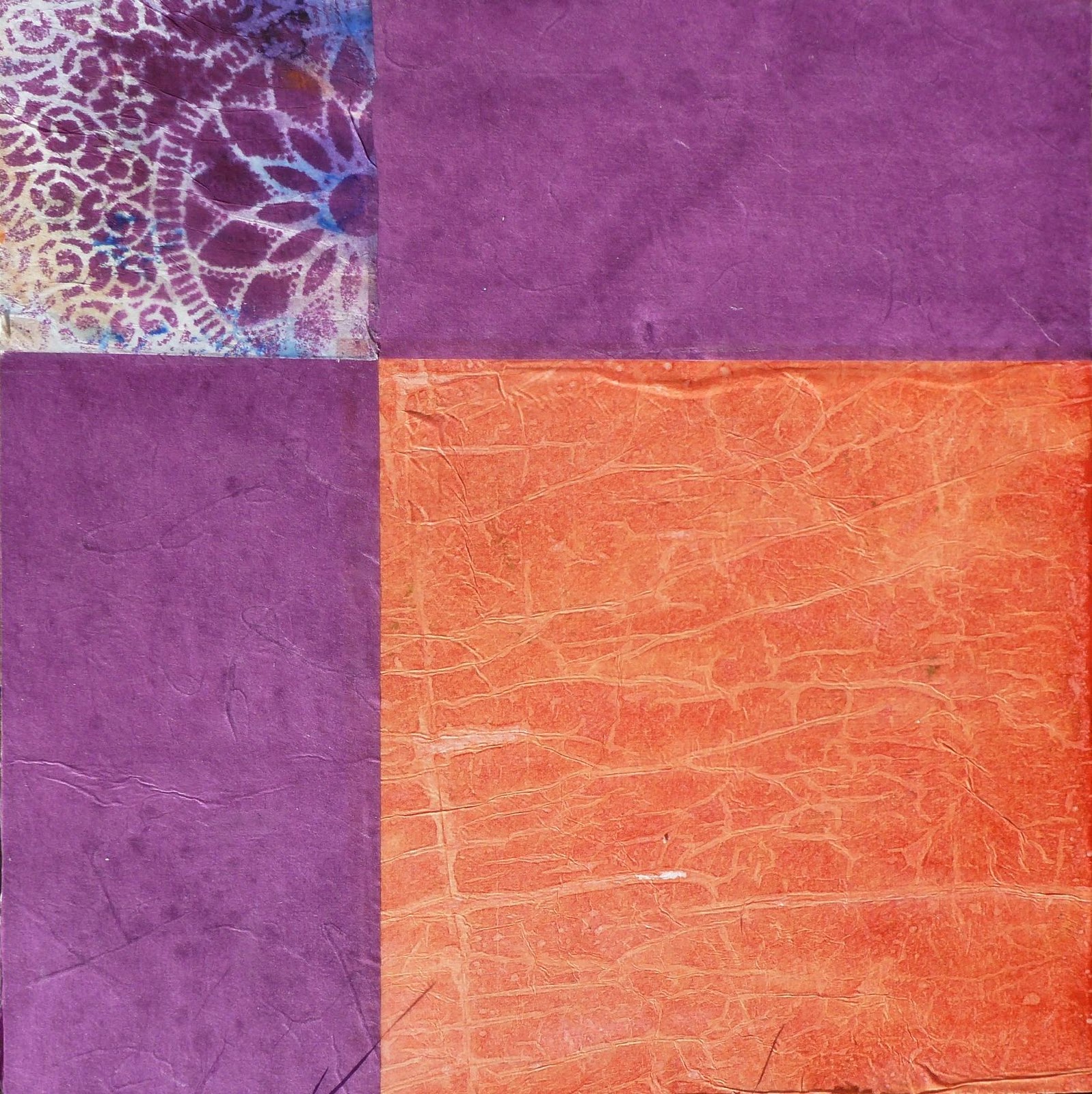
You know I love color and have had extensive training in using color. Having taught the standard color wheel I know that many people find it difficult to actually use the color wheel when making their art. So… I decided to make twelve 12” x 12” collage paintings with each one based on one of the colors in the color wheel to show you how it might be done. I made the primary-color pieces first, complemented with black and white. Then I made the secondary and tertiary versions, some accented with its complement (opposite color on the color wheel) or with its split complement. The results are an interesting grouping.


Here's a peek at my process for "Purple":


Let me tell you.... It took lots of head-scratching to decide what I think of as purple. Does it lean toward blue or toward red? Is it violet, periwinkle, blueberry.  Oh my. I pulled out my drawer of purple painted papers and chose a variety of papers to audition for this piece.  


More head-scratching let me to narrowing down the selection to these pieces to use as the first layers. This is what it looked like laid out and photographed as a 12" square-ish shape.

"PURPLE"   $375

More decisions, more auditioning, more papers, some marks and stenciling led me to this this finished work. 

You're welcome to copy the following list of my processes if it will help you in your own art making.

COLLAGE PROCESS
  • Build the background with paper and paint
  • Add images, photographs, marks, stencils and stamps
  • Seal with gloss medium
  • Add photo transfers, if desired.
  • Make more marks. Add glazes.
  • Seal again with gloss medium, or with matte medium if you prefer a matte surface.
  • Photograph.
  • Finish the edges of the cradle, if using.
  • Frame the work.
  • Sign on the front and on the back
  • Add to your inventory, with pricing.


Monday, August 03, 2015

RainForest

After several weeks away from my studio I'm back at work on some new collages and paintings in preparation for the Portland Open Studios Tour and the Washington County Studio Tour in October. While the tour is meant to be educational in nature I want to have lots of new work on my walls.

It's been hotter and drier here in Portland than I can remember in my 50-plus years as an Oregon resident. Not only is the grass brown but shrubs and trees are dying from the prolonged abnormal temperatures. Perhaps longing for rain is what drove me to think about rainforests and plentiful water, orange ponchos, and trudging along forest trails.

Here's RainForest, collage on board, 12x12".


Portland Open Studios Tour;  October 10, 11, 17, 18, 2015.
Washington Country Studio Tour: October 17 and 18, 2015.

Friday, July 03, 2015

Naming artworks

Tree and Shadow


This painting needs a name. Will you help name it, please?

Titles....
Perhaps my way of finding titles will help you. I keep a dedicated journal on my desk that's just for titles and quotations. Whenever I find a title I like, into the book it goes. I find titles everywhere, just not when I'm in the midst of painting. So where do I find titles?
  • Gallery shows. 
  • Plant catalogs. (This is where I found the title, Red Hot Mama.)
  • Song titles and musical terms.
  • Thesaurus and the dictionary.
  • Book or chapter titles.
  • Phrases taken from my Bible or other books.
  • Online galleries and websites.
  • Note the titles other artists use for their works. Titles aren't protected by copyright and this is one place I "steal like an artist". I've yet to use a title that I don't change somehow but I know the day will come and I don't call that dishonest, and I hereby give you permission to copy my titles.
How do you title your own work?

Shadow photos....
Photos of my shadow are my version of selfies and lately I've been incorporating the shadow photos in my collages, sometimes directly by gluing the photo into the composition or like this one, printed onto a paper that I intend to use in the collage.

With the proper printer setting one can print on just about anything that will feed through the printer. I've printed text onto photographs, photographs onto painted paper, and in this case I printed a photo onto a magazine page that I had manipulated with solvent. Try it yourself.

I've learned....
  • Inkjet printers don't work well for this technique. Use a laser printer or toner copier, set to black/white. Printing in color should work if you have a color laser printer. I haven't tried it since I don't have one.
  • Lessen the contrast so that the black of the ink doesn't obscure the paper. Or...
  • If you want a silhouette with strong black, then increase the black in your camera software.
  • Experiment to see what you can do.
It's all about process....
Of course much of this would be easier done digitally in your computer program, i.e. Photoshop, but I am a tactile person and I have to have my hands on the paper, the scissors, and get my fingers covered with glue. Otherwise I don't feel like I've made art. The more of me I can get into the work the better I like the process.

Wednesday, April 29, 2015

sometimes there's a better way

While gathering completed works for the Hillsboro library show I put my hand on a collage that needed help. I liked the concept and most of the details but the design of the flower and the title weren't right.
Red Flower
So I fixed it. And changed it's name. Now I like it.
Red Hot Mama
Jo Reimer's collages will be shown at the Hillsboro Main Library, 2850 NE Brookwood Pkwy, Hillsboro, OR 97124 throughout the months of May and June during library hours. You're invited to an artists reception in the Board Room on the second floor, Saturday May 16 between 2 and 4.

Monday, November 03, 2014

200 For Under $200


GENTLE PERSUASION by Jo Reimer
I'm delivering three new collages to Oregon Society of Artists today to be in their November show called 200 FOR UNDER $200.  It pains me a bit to let these go for so little but I'm committed.

The rules for this exhibit are interesting. The artist buys three 12" x 12" deep-cradled panels from the gallery which serves as the entry fee. Make the art on the panels and return the finished work. I think all the pieces will be hung so it will be a mixed bag.

APPROACHING STILLNESS by Jo Reimer
These new works feature more of my self-generated papers as well as a few solid colors from commercial sources such as the black in the upper right corner. I know it reads as blue, but it's really black. Other papers include magazine pages that I altered with an orange solvent.

PARALLEL PASSAGES by Jo Reimer
Once the papers were firmly adhered to the substrate and coated with a layer of medium I applied layers of cold wax to protect the work and give the surface a soft glow. The sides were left natural, protected by layers of wax.

As I said, the works are under priced but once I started working on the panels, pursuing a new idea which led to something new, I realized that this was about something more important to me, a suggestion for a new direction. I'm eager to work larger.

In my next post I'll show you the four similar pieces that will be delivered to Cannon Beach Gallery later in the week.


Thursday, September 20, 2012

Summer Day, a painting

by Jo Reimer
Summer Day
acrylic, ink, paper, 12 x 12 panel
I've been having a grand time taking half-done paintings and seeing how I can resurrect them. Like this one.  I loved the hot colors but simply couldn't seem to figure out how to make anything of it.  Finally I simply started playing, adding and subtracting elements. This is the result. It looks great in a simple black frame.

Sunday, June 10, 2012

English, Iris

English, Iris. 4.1
12" x 12"
Collage on Board
It's springtime in Oregon and the iris are in bloom. My favorite iris grower is Schreiners Iris Gardens which is located in the valley south of Portland.  This time of year the fields are in colorful bloom and their show gardens are amazing. I love to photograph the iris, the closer the better.

Peter Schutte, a world famous photographer who lives in Portland conducts a photography class called The Fantastic Iris and Other Flowers. If you're local and want to learn more about flower photography hop on over to Peter's website and sign up for one of his classes.

Friday, January 27, 2012

Piecings, continued

by Jo Reimer

These are more of the Piecings series of collage paintings I've been working on this week. I'm quite happy with a couple of them but not so much with others. I keep telling myself that this is just a start, that more and better work will come as I continue seeing what I can do with my palette of papers.

Orange, study
12 x 12" on panel

One thing that frustrates me has to do with how I work with my paper collection.

Most of my painted papers are in a big drawer in my work table. The drawer isn't full but it's cluttered and I've spent lots of frustrating time pawing through the paper, seeking just the right one. Sometimes it's color I'm hunting; sometimes it's visual texture or pattern. I'm not sure if I have too many papers or not enough variety.

Elizabeth Nelson sorts her painted papers in 9 see-through drawers, by color family. See her in action here.

Marge Malwitz sorts hers into flat cardboard boxes which she pulls from a cabinet.

I'm sure either system would work better for me than having everything in one big drawer.  I just need to make time to do the sorting and set up a system to keep it all under control. I put smaller bits in plastic boxes which I've dubbed "Compost" bins. That works well for smaller pieces or when I'm traveling... not so much for larger works such as I am aiming to do.

Purples, study
12 x 12 on panel

Split Complements, study
12 x 12 on panel
The following piece was done on a canvas board. The white paper and gold paper with grids is some I made myself. I laid linen thread between two sheets of tissue paper and then coated it carefully with gloss medium to seal the thread between the layers. This is NOT a favorite because I think the green paper strip is too wide but by the time I realized it the glue was well on its way to dry. It's a study and I learned from doing it.

Grid Study
12 x 16

How do you sort your collage papers?


Thursday, December 22, 2011

Cut and Come Again ... Collage

Cut and Come Again
16 x 20"
Fabric, Paper, Stitching on Canvas

Cut and Come Again, detail

I'm continuing my experiments with marrying the idea of piecing quilts with collage. In Cut and Come Again I composed the design using a mixture of paper and fabric to create the feeling of a summertime zinnia from my garden. The substrate is canvas. No glue was used except for a spot here and there to tack the elements in place until they were stitched.

I Have Reasons
11 x 15"
Collage on Paper
SOLD
I started with a collage of previously painted papers and then applied layers of acrylic paint to add depth and texture.

Elegans
Collage and Acrylic on Panel
12 x 12"
Working directly on Gessobord panel I painted on top of a collage of painted papers.

Winter Elk Sighting
Collage on Canvas Panel
11 x 14"
The various white papers that depict a snowy winter storm are gesso on magazine papers. The elk red-on-black images are from a commercial paper.

Wednesday, November 02, 2011

Sango Kaku... an acrylic painting

Sango Kaku  

This acrylic painting was done on a cradled 12x12" canvas.
Our back yard is filled with beautiful trees, many of which are Japanese Maples that we grow at our nursery. The Sango Kaku, aka Coral Bark Maple, is amazing any time of the year with green gold leaves in spring and summer, turning yellow and then coral in autumn. Then after the leaves drop the twigs and branches turn bright coral red to brighten our winter landscape. 

I stare at the tree from my studio and kitchen windows and have taken several photos over the years. Finally I decided to paint it. Why render an exact copy in paint? That's not my kind of art. So I set out to paint my feelings about the tree. When I finished I thought I had failed, but today I realize that I managed to capture the essence of the tree. A burst of yellow orange. Accents of bright rusty orangey red at the edges. The afternoon light striking the leaves, making them glow. Coral bark. Blue sky reflected in the pond. 

I'm not so sure about the underlying grid... but that's part of my history and way of working. So there!

Related Posts Plugin for WordPress, Blogger...