Thursday, March 15, 2012

First Sign of Spring


by Jo Reimer

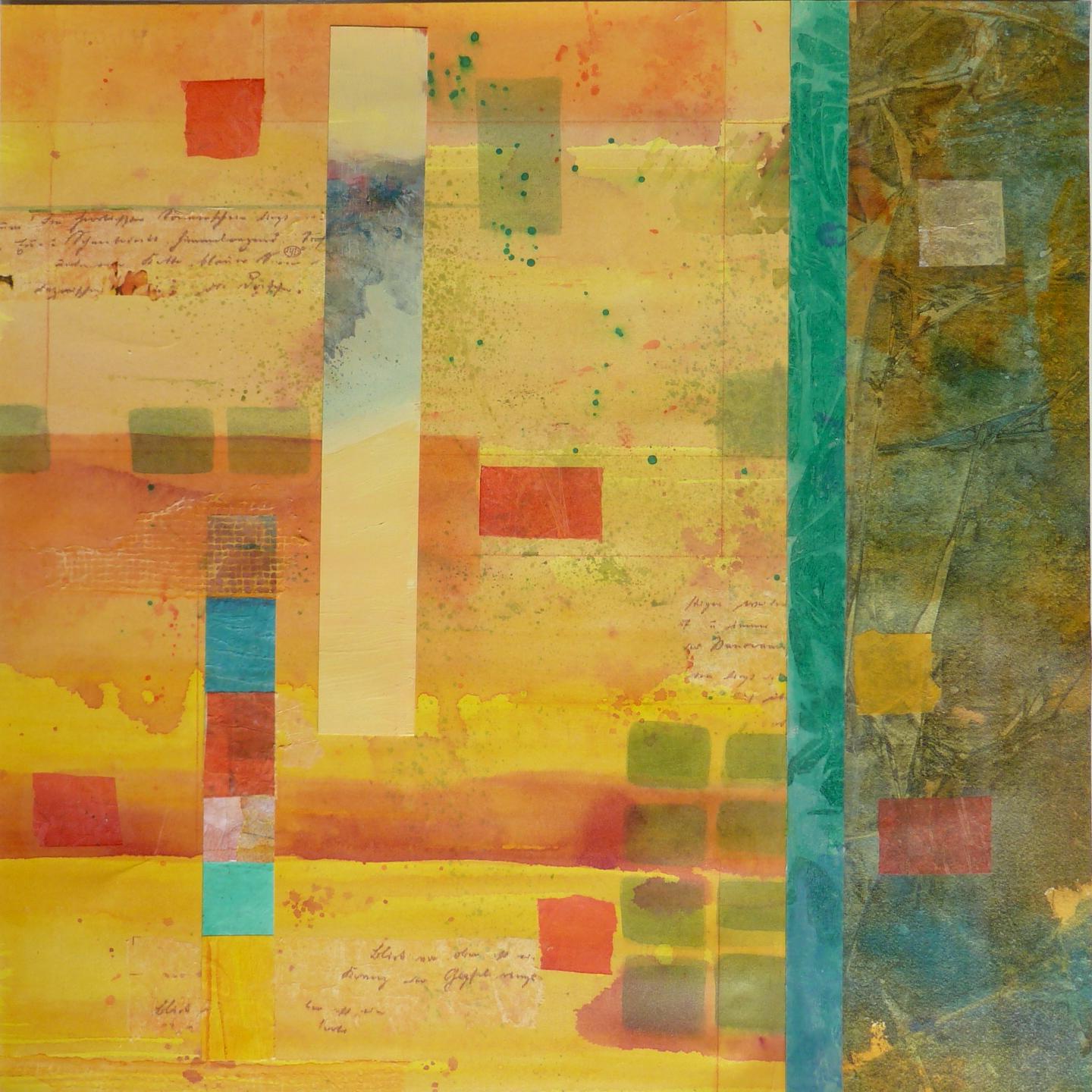
"First Sign of Spring"
Collage
20" x 20"

It's interesting to see where my "Piecings" and "Slices" series are taking me. I think it's actually one series. There's no direct painting on this piece; it's made up of slices of other paintings that weren't worthy in themselves but as an assembly of parts the whole has become quite strong.

I find myself struggling with establishing a process for these pieces, mostly having to do with mounting. I've been working mostly on 140# watercolor paper as a substrate which starts to buckle as layers are joined, and then wrestling with the completed work to attach it to a firm support... so I'm finding ways to reduce the buckling in the beginning. Using a stronger support is one way to keep the work flat, adhering the base paper to mat board or acid free foamcore or even wood panels. I think there'll be fewer struggles if I start with a firm substrate, glue the base papers to that and then continue to layer whatever papers I need for the collage. I could start with 300# paper or illustration board or heavy Yupo, all of which hold their shape well.

I'm open to suggestions.

Tuesday, March 13, 2012

Collage: Another Slice of Life

by Jo Reimer
950 Kapaa
Collage on Paper
11" x 30"
For this collage I used mostly my own handpainted papers. The paper with the numbers was discarded on the road outside our beach retreat a few years ago when our family went to Hawaii to celebrate a significant anniversary. It's such a useful bit of paper that I think I'll repeat the idea using number stencils and significant number combinations such as house numbers, birthdates, anniversaries. I think it's important to mine ones' own life for symbolism to use in ones' art... a post for another day.

Thursday, March 01, 2012

Sliver of Landscape

by Jo Reimer
Outback Red - sold
12" x 30"
collage on paper

I'm still working on the "Piecings" series (need a better name!). I started doodling in the margins of Sunday morning sermon note paper, drawing skinny rectangles and imaging them as slivers of landscape as seen through narrow windows or the arrow slots in medieval castle battlements, with the view divided into sky, forests or crops, and the land below.

detail
I continued drawing these compositions, eventually thinking of them as collages, pieced together from paper and maybe even fabric.

This is the first Sliver. I have another sliver on my easel and am chomping at the bit to get back to work.


Wednesday, February 22, 2012

Moleskine Reloaded

by Jo Reimer

Years ago I started carrying a small Moleskine Sketchbook in my handbag and used it to capture thoughts and sketches. At only 3.5" x 5.5" it fits just right in my handbag or jacket pocket. I like the sturdy cover, the built-in pocket inside the back cover and the little strap that marks my place or keeps my book closed. Now that I have a collection started I don't want to carry any other sketchbook.

But there's a problem.

The paper in the Moleskine Sketchbook is a creamy yellow and resists my watercolor paint. I put up with it through the first 3 books but then I ran across a tutorial by Martha, author of the blog, Trumpetvine Travels, called Moleskine Reloaded ...or, How to Rebind a Moleskine Notebook: Make a Custom DIY Sketchbook.

My problem was solved.

For the first one, my Israel Sketchbook, I gutted a full-priced sketchbook and reloaded it with papers of my choosing. I loved the new paper but it made an expensive sketchbook.

Then I got smart.

I found out-dated Moleskine Pocket Diarys online for one-fourth the price and ordered half a dozen so that when I gut the book I feel no guilt at messing up a perfectly good book.

The first step is to cut the book block out of it's cover. The first picture shows a pristine Pocket Diary and another one with the book block removed from its cover.

I use 2 sheets of Fabriano or Arches 90# watercolor paper and tear down the pages as Martha directs.
The papers are folded in half and one slipped into another to form a signature and holes are punched in the spine for the sewing.


Next comes the sewing of the 13 signatures using waxed linen thread.


Lastly I glued the front page to the inside front cover and the back page to the back cover, and let the glue dry.  My new sketchbook is ready to use. It looks just like the original but nicer around the edges. Instead of cutting the paper with machine to produce straight outer edges I tore my paper with my bone folder so that all the edges are deckled. I love the texture and it's so much more interesting.


I reserve the book block from the diary and keep it on my desk to use for notes, lists, reminders, ideas. The print is very faint and doesn't interfere with pen and ink. I've recycled all the bits and pieces of paper that once littered my desk.

When figure out how to make a video with my new Panasonic Lumix I'll show you my latest completed sketchbook.

Thursday, February 16, 2012

Re-arranging My Studio

by Jo Reimer


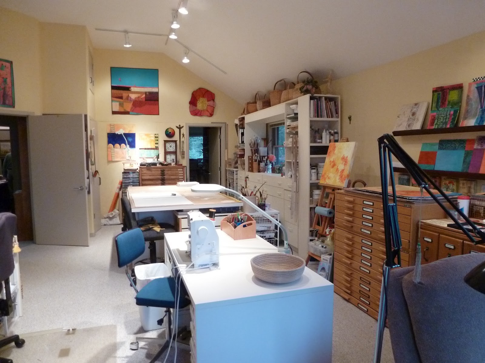
A Change of Scenery, indoors

I've been rearranging my studio, never an easy process but one that's necessary now and then. I find that a change in the scenery can trigger motivation to work whether the scenery change is a walk through someone else's neighborhood, being a passenger for a Sunday afternoon drive into the country, or changing one's own physical surroundings.

Floor Plugs, love 'em or hate 'em

When we designed this house I asked for floor plugs in the studio and in the living room so I wouldn't have electric cords snaking across the floor. I got the plugs and they were okay for the first few years until I reverted to my natural inclimation to rearrange furniture. Now I have extension cords attached to the floor plugs and have had to teach myself not to trip over them.

This studio has seen three major shifts in layout.

It was designed to be a quilting/sewing studio and it was perfect for about six years, was even featured  in Rainey-Black's Dream Sewing Spaces.  The author is an interior designer specializing in kitchen planning, concepts which directly apply to studio planning as far as cabinetry and workspace is concerned and she helped me with arrangement of equipment in the studio space.

Shooting the pictures for this book was a hoot. My studio is a huge loft above the garage and looks over our home's public spaces. At one point the photographer stood on a tall ladder in the living room in order to shoot this picture.
Sewing Studio 1995


Then in 1998 I sold my pattern business, Saf-T-Pockets, and started drawing and painting so the studio arrangement needed to change. 

Recently I needed a dedicated reading corner. I have built-in shelves under the corner windows that give me a garden and sky view. the corner hadn't served a good purpose since I removed the shipping station and was most often a catch-all sort of space.

Reading Corner
Reading corner, before
Reading corner, after
Tables 
previous arrangement of my 3 large tables
Table: 4x6 ft. with 2 24" drop leaves
large painting table with easel and flat files.
Counter and Desk

33" deep counter

 the counter ends at my desk which is always a mess.
You might wonder about the neon sign. My daughter spotted the neon sign stored in a friend's garage and traded a crib and baby clothes for it. 

Library
Library
 These are all art books, arranged by type: book-binding and art journals, drawing, oil, acrylics, watercolor, artists, art, with the few remaining quilting and sewing books on the lowest shelf. the two upper shelves on the right are studio journals which I've filled over the last 20 years.

cluttered but organized
Present Arrangement

Moving that big table requires muscle even though it's on wheels. The wheels should be larger and as we were muscling it across the room one wheel broke off. We waited for sons and grandson to visit and the younger guys lifted the corner while my husband put a block underneath. Something tells me that this table will never move again.


I turned the collage table around and butted it up against one of the 30 x 60 tables. This will be my sit down station for collage and watercolor and for working in journals. I can turn my desk chair around and work from there, too.  The sewing station is on the other 30 x 60 table, lower right of the picture, but since I don't sew much now it'll be another workspace for whatever I need.


So that's it.  All that's left to do is to tame the clutter on my desk and counter and get to work making art. Right now I just want to make art... so I will.

Advice gained from experience

Not everyone gets to have a dream studio like my present one.

For the first 10 years of our marraige I had NO studio. I worked out of boxes and baskets on the kitchen table or in my lap. Then we moved to a larger house and I used a room that doubled as laundry room and dining room, thanks to appliances and art supplies stored in built-in cabinets.

The next move allowed me to have a tiny nook off the kitchen to use as a studio. Then I moved to a spare bedroom, and eventually to the rec room after our kids left home.

We designed and built our present house, complete with my wonderful studio, 20 years ago, and thanks to my favorite architect I have the space I need.

Makes do with what you have.

I heard that when wearables artist Yvonne Porcella started out she had only the top of the washing machine on which to work. So she designed clothing that was made up of modules, none larger than the washing machine. 

If I ever have to move from here I'll think seriously about renting a studio... or make small art.

Divide your work space into stations
  • even if you have only a desk or several baskets. designate what activity happens in or out of each... drawing, cutting, painting, sewing, shipping.
  • Put your tools and supplies at the point of first use... if you're right handed put your scissors and pens on the right side. Keep your paints and mediums within reach in your painting station, not across the room.
  • Buy several pairs of scissors and have one in each station so you don't have to walk across the room to find a pair.
Don't use your studio for inactive storage. that's what the basement is for.

Friday, February 03, 2012

Golden Morning Light

by Jo Reimer
Golden Morning Light
10 x 13
watermedia
As I opened my eyes this morning and looked out the window the trees to the west were bathed in an intense golden light which turned non-descript gray barked trees into something magical. I tried to capture the essense of the moment. It's there but mostly in my memory. My painting skills aren't there... yet.

Monday, January 30, 2012

Randall David Tipton workshop

by Jo Reimer
Refuge
Watermedia on Yupo
20" x 13"
Refuge
matted

I participated in a workshop with Randall David Tipton over the weekend, making paintings on Yupo, a plastic "paper" from Japan. Randall shared his methods for using watercolor and acrylic paints and mediums on this interesting surface, but most importantly he talked to us about interacting with the landscape and remembering the emotion of the moment in order to make a painting without being photo-realistic. We mostly painted from memory.

In the past as I've moved through the landscape and been moved by the beauty of this earth, my thoughts have been rather useless for informing future work. I didn't think carefully about what I was seeing. I didn't ask questions of myself, like 'what is it about that patch of brush that I find beautiful?' or 'why does this particular sunset move me to tears?' 

I do take a lot of photographs and am careful about compositon which does help with memory, as does sketching. But being mindful about the emotions of the moment is necessary to making good paintings later.

Undersea
Watermedia on Yupo
20" x 13"
Undersea
matted
A mat makes a big difference in
the presentation of a finished piece.

Randall's website is here and his blog is here. His work is available at the White Bird Gallery in Cannon Beach and directly from him. His price list is on his blog.

My work is also available.


Friday, January 27, 2012

Piecings, continued

by Jo Reimer

These are more of the Piecings series of collage paintings I've been working on this week. I'm quite happy with a couple of them but not so much with others. I keep telling myself that this is just a start, that more and better work will come as I continue seeing what I can do with my palette of papers.

Orange, study
12 x 12" on panel

One thing that frustrates me has to do with how I work with my paper collection.

Most of my painted papers are in a big drawer in my work table. The drawer isn't full but it's cluttered and I've spent lots of frustrating time pawing through the paper, seeking just the right one. Sometimes it's color I'm hunting; sometimes it's visual texture or pattern. I'm not sure if I have too many papers or not enough variety.

Elizabeth Nelson sorts her painted papers in 9 see-through drawers, by color family. See her in action here.

Marge Malwitz sorts hers into flat cardboard boxes which she pulls from a cabinet.

I'm sure either system would work better for me than having everything in one big drawer.  I just need to make time to do the sorting and set up a system to keep it all under control. I put smaller bits in plastic boxes which I've dubbed "Compost" bins. That works well for smaller pieces or when I'm traveling... not so much for larger works such as I am aiming to do.

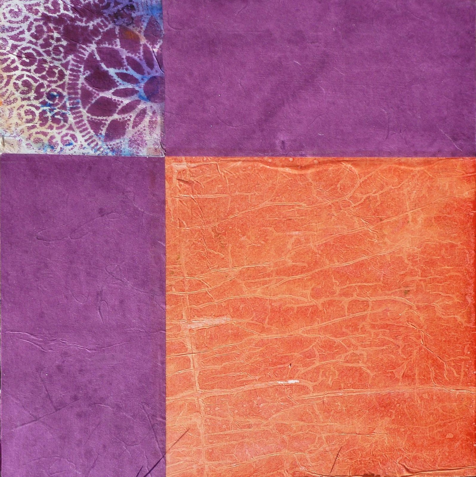
Purples, study
12 x 12 on panel

Split Complements, study
12 x 12 on panel
The following piece was done on a canvas board. The white paper and gold paper with grids is some I made myself. I laid linen thread between two sheets of tissue paper and then coated it carefully with gloss medium to seal the thread between the layers. This is NOT a favorite because I think the green paper strip is too wide but by the time I realized it the glue was well on its way to dry. It's a study and I learned from doing it.

Grid Study
12 x 16

How do you sort your collage papers?


Monday, January 23, 2012

Showing My Work

by Jo Reimer
photo by Marnie Fordice

Some artists wait forever and never have an opportunity to show their best work to the public.

Some artists show several times a year, all over the country.

Some have a once-in-a-lifetime opportunity... that's me.

Thirty original pieces from my Sermon Note series are hanging in the lobby of my church and will be up a total of 4 months by the time the work comes down on February 20. If you're in the area and want to see it shoot me an email at joreimer at comcast.net and I'll meet you there. It's on Cornell Road in Cedar Mill, Oregon.

In addition to the thirty original pieces ten 3' x 4' prints hang on the big walls. On the 9th of January there was a reception for me with 50 people in attendance. I spoke about how art and faith intersect for me and then the floor was opened to a lively discussion. It's difficult to explain how much this meant to me... to be a conduit for things that God wanted to visualize through me, and to be able to show the work to hundreds of people over such a great length of time. I'm humbled, and amazed, and grateful.


photo by Marnie Fordice

If you're interested in what I had to say I'll be glad to email the text of the presentation to you. Just ask. (email address above)


Wednesday, January 18, 2012

Embellishing Monotypes

by Jo Reimer

Last summer I took a 6 day Monotype in the studio of William Park, a Portland area painter/printer, co-taught by Bill and Royal Nebeker of Astoria. In that time I made a couple dozen prints. You won't see most of them. Occasionally I pull the stack out of my flat files to have a look but hadn't done anything with them until this morning. I got an email from Bill about a new monotype workshop he's offering and I decided I'd do something with the work I've already created. I enjoyed the class, learned to appreciate monotypes and monoprints, and am still a bit confused about the difference.  The discipline isn't for me. I'll stick to painting and collage.

So, I selected a couple of the duds and played around with them using oil pastels until I felt confident enough to work on the slightly better prints.

Put A Bird On It, print
The challenge given by Royal Nebeker in an evening session was to work with a stencil. (It's not really a stencil but that's what he called it.) It's a mask, used to prevent an area from transfering ink from the plate to the paper. You see several masks here. The lace shape on the left is a paper doily. The vase is a rectangle of paper, the long purple triangles are paper as is the bird.

I first painted the acrylic plate with inks and arranged the masks on top of the ink. Then the dry paper was placed over the plate and the sandwich was run through the press. Then I removed the masks, re-inked the plate with different colors and printed again.  At least that's what I remember. It was a blur of new techniques at the time and it's still a bit of a blur.

This is #1 raw print just as it came off the press. The problems I see are many...
     All similar values...
     Unrelated and uninteresting background colors
     Nothing pops... there's no focal point unless you count the ghostly bird


Here is the same print. I used oil pastels to increase color saturation here and there and to add more elements to the work, changing the ghost bird to a blue bird and adding more of the long triangles at the top. It's better, or maybe just different?

Besides William Park and Royal Nebeker my favorite local artist working with monoprinting is Kim Osgood.

Have you tried monotype? What do you like about the process? Do you use it as a first step or do you prefer the pure process?
Related Posts Plugin for WordPress, Blogger...