 |
| Faded Glory Collage on Board 16 x 16" |

Jo Reimer, an artist, living and working in Portland Oregon
Monday, April 08, 2013
Wednesday, March 27, 2013
Collage Made From Compost
 |
| In the Garden Collage on paper 8x8" |
The bright orange is the substrate which I painted by smooshing acrylic paint around on the surface. There's a bit of paper napkin, a photograph of maple leaves, a magazine image, and a color copied strip from an old painting. Simple items and a combination of stripes result in a happy piece.
Then there's this one.
 |
| Chaos Collage on Paper 8 x 8" |
Let's analye it according to the elements and principles of design:
- Line: vertical and diagonal suggest movement.
- Texture: visual texture of printed vs plain vs translucent invites touch.
- Color: Complementary violet and yellow with an accent of blue green.
- Composition: Cruciform
- Balance: yes, in all directions
- Value: ah, there's my problem with the orange strip. It tipped the scale of value toward equal balance of value. Without the orange strip the dark areas dominate and composition is better. But I just couldn't leave well enough alone.
- Repetition: There's plenty of repetition within each color family as well as repetition of line.
- Contrast: yep, lots of that.
- Dominance, unity, harmony: check.
Do you ever pull out your list of elements and principles and use them to check your work? I find it's helpful when I'm puzzled about why a piece leaves me with a negative feeling.
Thursday, February 28, 2013
Grass and Forest painting
 |
| Grass and Forest acrylic on paper 15" x 11" |
I used both fluid and heavy body acrylics, a mix of Golden and Holbein. with lots of water to make the work juicy. I'm leaning strongly toward using the thinner paint because I invaribly like to work thin so I get to play with drips and splatters.
Wednesday, February 27, 2013
 |
| My daughter and her daughter at about the same ages. From my journal What Matters Most. |
Valerie Sjodin of Visual Blessings http://visualblessings.blogspot.com/ has blessed me with the Liebster Award and in the spirit of the award I'm paying it forward. Though I don't usually do blog awards, this one is worthwhile if it helps increase traffic for other blogs and helps you find blogs that are new to you and are worth your time to read and follow.
 ABOUT THE AWARD
This award was designed in the pay it
forward fashion. Once you've been nominated, you award it to five blogs that you
like that have fewer than 200 followers, to encourage new visitors to visit
these blogs.
RULES FOR ACCEPTANCE
Thank the person who gave you the award and link back to
their blog. Post the award onto your blog. Give the award to five bloggers who
you appreciate that have fewer than 200 followers. Leave a comment on their blog
letting them know that you have given them this awesome award!
PAY IT FORWARD
I tried to stay within the parameters of the rules but since many people don't include a Followers area on their blog I didn't pay a great deal of attention to that.
Here are my choices of inspiring art blogs that feature lovely artwork and some step-by-step or how-to's. (alphabetical order, of course. how could one rank such a list?)
Crystal Neubauer: http://otherpeoplesflowers.blogspot.com/
Donna Zagotta: http://donnazagotta.com/blog/
Laura Lein-Svenener: http://lonecrowart.blogspot.com/
Donna Zagotta: http://donnazagotta.com/blog/
Laura Lein-Svenener: http://lonecrowart.blogspot.com/
Randall David Tipton: http://randalldavidtipton.blogspot.com/
Joyce Washor: http://joycewashorsdailypaintings.blogspot.com/
Joyce Washor: http://joycewashorsdailypaintings.blogspot.com/
I've found that the internet art-blogging community is supportive and giving in a variety of ways. I hope that you will visit all the blogs that I've listed in my sidebar; there's something there for everyone.
Friday, February 22, 2013
Studio Table and Watercolor Paint Choices

Here it is the end of the week and I haven't posted about this weeks' work in the studio. There hasn't been a lot, and no painting, no collage. I've been cleaning up the garden instead. But I have been working in the studio, tossing a full cabinet drawer of files and reorganizing the remaining two drawers. It feels so good to have accomplished that.
With spring coming early to Oregon I decided to spend time on my sketching tools and the various bags I carry. Here you see an area of my counter with some of the tools of my trade. Granted I'm at the end of the process so it looks tidy but you should have seen the mess.
The black bag on the right stays in the backseat floorboard of my car. The bag was intended to be a cosmetic bag for travel but it works better for sketching and paint tools. The open palette is a W&N Cotman kit that was a freebie years ago and has seen lots of use. It's cleaned up for the season and mostly filled with my limited palette.
 |
| Some basic tools and a book I'm reading. |
 |
| Here's the car paint bag closed. 10" x 7" x 3" nylon |
 |
| Opened partially, showing the handy compartments. |
 |
| Opened all the way. |
 |
| Watercolor, Collage, Journaling Table |
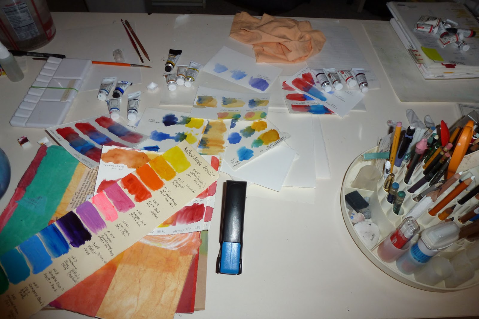
For testing I gathered a stack of small pieces watercolor paper scraps and proceeded to test. I don't really know how to approach this so I just winged it. I first chose 3 blues and painted large spots of each down one side of the paper (see upper middle of picture) and then chose one yellow and painted beside and into each blue to see what sort of green the combination would give me. And that's how I approached each color in turn.
If you have a better way, please let me know.
I know I'll be painting with acrylics again and wanted to see how complete is my collection of Holbein Acryla acrylics. (The long narrow strip in the lower left of the picture is my record of colors I own.) Holbein uses such odd color names. For example, Flame red is really Napthol, PR9, but the only way to know that is to find the tiny paint number on the back of the tube. So I hightailed it to Blick downtown and wrote the paint number on my Holbein chart so I'll know what to order in the future and bought a replacement since that's a frequently used one.
Or maybe I'll revert to slinging paint based on what it looks like. Probably will. Being organized takes the fun out of it for me. So why go to this trouble? I need to know how to mix paint properly before I have the confidence to work with abandon. Otherwise I'm sure I'd just make ugly messes... like I've done too many times already.
That's my story and I'm sticking to it. I hope you all have a great weekend. Make something pretty.
Friday, February 15, 2013
Prairie Grass - Oklahoma
 |
| Prairie Grass - Oklahoma collage on paper 16 x 20" |
My husband and I met in college, in Stillwater, OK. He was raised in southwestern Oklahoma and after college we lived and worked in the state until moving to Oregon. Being from Arkansas I knew little about Oklahoma history and the required coursework about my adopted state was fascinating.
I read tales of the five civilized tribes, early white settlers, the Sooners who jumped into the land rush too soon, and of womens struggles to make a home on the prairie where conditions were harsh. Many, including my husbands relatives, scraped back the prairie grasses and dug homes into the red soil, using what precious wood they could find to build the upper walls, roof and door on their dugout home.
The Oklahoma prairie was beautiful before the farmers settled the land and changed the landscape forever. The grasses were tall, the skies vast, the bison plentiful. Some settlers recognized the value of the prairie grass as cattle feed but much of it was plowed and planted with crops, contributing to the horrors of the Dust Bowl era. Now several land conservancy groups are returning portions of the land to its natural state.
There are incredible photographs of prairie grass online here.
As I thought about images of Oklahoma the most striking to me are those of grass and giant blue skies. The thin slices of paper which indicate prairie grass are proportionally too wide for the scale of the composition, indicating the immensitiy of the prairie. My art is about my emotionalal response to the location, not a photo-realistic representation. There's a dichotomy here of nature vs. present day infrastructure, a land which only 100 years ago was prairie and bison and is now criss-crossed with highways and dotted with cities. The prairies are growing back and the bison are thriving on preserves. It's about time.
Tuesday, February 05, 2013
Ochoco Forest - mapping series
by Jo Reimer
The Ochoco Forest and its neighbor, the Malheur Forest, is located in central Oregon. The area is one of immense beauty and teems with wildlife especially migratory birds which call it home.
And there are BIG trees, all over Oregon.
I was lucky to have a map large enough to cover the lower part of my canvas and from there it was a matter of finding the right combination of greens and browns in my paper stash to make the statement I intended.
 |
| Ochoco Forest 14 x 18 Collage on Canvas by Jo Reimer |
And there are BIG trees, all over Oregon.
I was lucky to have a map large enough to cover the lower part of my canvas and from there it was a matter of finding the right combination of greens and browns in my paper stash to make the statement I intended.
Wednesday, January 30, 2013
Small Town Oregon... mapping
by Jo Reimer
Like many of you I often being my day with quiet meditation and writing in my journal, morphing from what has been into plans for the coming day in the studio. I explore ideas about current work during this time and jot down sketchy ideas about what I'll do with my studio time.
I'm continuing to explore ways to use my connection with maps in my artwork and am finding even more excitement in working through this series. This journey via my old maps just gets more interesting.
I've shredded maps; I've cut maps with scissors; I've torn maps; I've drawn the lines of highways, roads, and streets on paper and canvas; I've used maps as the substrate upon which I paint; I've glued maps onto just about anything that will hold still...
....and the ideas keep coming.
Small Town Oregon began as an atmospheric landscape painting in acrylic. It needed something more interesting than soft color so I asked the What If questions and decided to lift the maps of small towns upright as though the maps were being projected onto the sky.
Before I go much further I'll write a statement about the series so that it become clearer in my mind, not that this will be the final statement. It'll be refined as I work, but simply stating some of my intentions should help me leap ahead. It's one of the things I remember from Journalism 101... answer the questions: Who, What, When, Where, Why and How... and and my own mantra, What If... what could I do next because of what's been done.
 |
| Small Town Oregon Collage Painting 14" x 18" |
I'm continuing to explore ways to use my connection with maps in my artwork and am finding even more excitement in working through this series. This journey via my old maps just gets more interesting.
I've shredded maps; I've cut maps with scissors; I've torn maps; I've drawn the lines of highways, roads, and streets on paper and canvas; I've used maps as the substrate upon which I paint; I've glued maps onto just about anything that will hold still...
....and the ideas keep coming.
Small Town Oregon began as an atmospheric landscape painting in acrylic. It needed something more interesting than soft color so I asked the What If questions and decided to lift the maps of small towns upright as though the maps were being projected onto the sky.
Before I go much further I'll write a statement about the series so that it become clearer in my mind, not that this will be the final statement. It'll be refined as I work, but simply stating some of my intentions should help me leap ahead. It's one of the things I remember from Journalism 101... answer the questions: Who, What, When, Where, Why and How... and and my own mantra, What If... what could I do next because of what's been done.
Friday, January 11, 2013
Mapping New Work
I've collected road maps since our initial trip west, many of them free from gas stations along the way. Some are tourist maps of cities, some AAA maps, some hand drawn. Maps have been a large part of my life, and maybe yours, too, though we now rely on Google Maps and the maps in our smartphones and our GPS. I still print out maps because I'm so used to the paper map.
So... one day I decided to shred an old map see how I could use the strips creatively. To me the strips of map are the roadway, the directions for how to get somewhere, the path I traveled, and because I make an effort to make art that reflects my own life history and emotions it seemed appropriate to investigate where my map collection would take me on canvas and paper.
 | ||||
| Crossroads 22" x 17" acrylic and collage on paper |
 |
| From Franklin to Oneida 22" x 17" acrylic and collage on paper |
 |
| Sea City 10" x 10" acrylic and collage on paper |
The design for Sea City came about from looking at an actual map of a coastal city and adding the main streets to the painting as strips of maps, though not cut from a map of this actual city.
 |
| Toward Mill City 5" x 20" collage on board |
 |
| Wetlands 20" x 20" acrylic and collage on board |
 |
| From San Antonio to OKC 6" x 24" acrylic and collage on board |
As you can see, I continue to experiment with ways to use my maps. I've only scratched the surface as I search for more ways to use the idea of maps, travel, journey, and exploration. I have lots more ideas and since this work is moving along so fast I'm confident that I'll have many more pieces to show you in the future.
Friday, January 04, 2013
The Day's Ending
 |
| The Day's Ending 16 x 20" mixed fibers, fabric collage, stitching by Jo Reimer |
This year I'm determined to clear out more of the nooks and crannies of my home and pass the things I won't be using to others who might. I started with the shelves of fabric stored in my studio closet, and lo and behold I found two mostly half-done fiber pieces. I was inspired to see what I could do with them. I've always loved sunsets (and sunrises) and these held promise. So I finished them both and they're now ready to sell.
Working on these two pieces for a good part of the last two days reminded me once again why I've fallen in love with the immediacy of painting and collage. I could have done each of these works tons faster with a brush or glue pot. And my back wouldn't hurt as it does after hours at the sewing machine.
 |
| The Day's Ending 2 14 x 18" mixed fibers, fabric collage, stitching by Jo Reimer |
Subscribe to:
Posts (Atom)
